

“We were impressed by their dedicated communication and openness.”
We needed a website, logos, and promotional materials for both our advertising and marketing company and the music concerts we managed.
Working across a 12-hour time zone difference, Truelysis remained exceptionally responsive and easy to coordinate with, never letting the distance affect communication or project momentum.

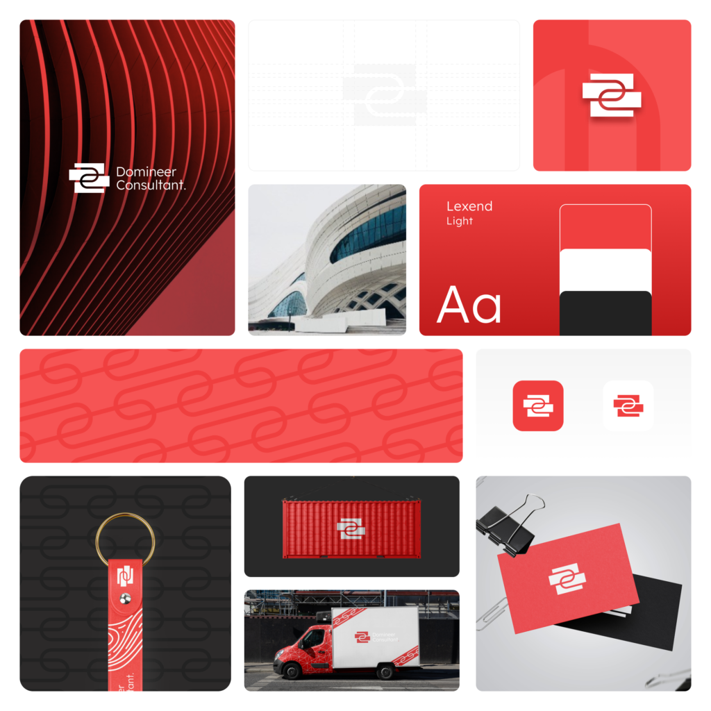
Working with Truelysis on our logo design was a great experience from start to finish. They took the time to understand our consulting business and what we wanted our brand to communicate, rather than simply creating a logo that looked good.
What stood out most was their ability to turn our ideas into a visual identity that feels both strong and flexible. The combination of solid structural elements with smooth, modern curves represents exactly what we wanted our brand to stand for-reliability, stability, and adaptability. The team was professional, creative, and easy to collaborate with throughout the process, and they paid close attention to the small details that made the final identity feel polished and distinctive.
We’re very happy with the final logo and the thought that went behind it. Truelysis understood our vision and delivered a professional identity that gives Domineer Consultant a strong foundation for the future.

Truelysis designed and developed a custom website for our marketing events that drove registrations and engagement. They handled everything from strategy and design through full development, delivering a fast, modern site that improved our registration numbers year over year.
Working with Truelysis was one of the best vendor partnerships we’ve had. We collaborated closely with their team to build a custom event marketing website, and the results were immediate—our registration numbers and engagement improved year over year, with better conversions than any previous site we’d run. What stood out most was how smoothly everything came together. The site was developed quickly, the process felt painless from kickoff to launch, and their team was responsive and collaborative at every stage. They understood our goals, adapted to our changing requirements without slowing down, and delivered ahead of schedule while maintaining quality throughout. The only thing to keep in mind for future projects: their schedule fills up fast, so booking further in advance helps secure availability.
I worked with Sati and his team on web design for Studio10Live.ca. They were professional and easy to collaborate with throughout the process. We built the website and mobile site exactly as I envisioned them, with clean coding and functionality across both desktop browsers and mobile devices.
I contacted Sati with a simple inquiry, and he made me feel like I was speaking to family. His professionalism and ideas gave me the confidence to trust him and his team with the project.

Truelysis is managing our website and social media presence. They built our social media strategy from the ground up and consistently bring innovative ideas to engage our followers. The experience has been positive so far.
The experience has been very good so far. They have expertise in every area we wanted to work on and handled everything very professionally. They do extensive research before starting any work and plan everything well in advance. They maintain proper reports of what’s been done, and we’ve seen real improvements in our website design and traffic. The content they create is on point from the first draft—we’ve never had to ask for major changes.